Rethinking a dating app for more culture and engagement.
Rethinking a dating app for more culture and engagement.
Rethinking a dating app for more culture and engagement.
Problem Overview
Krush struggles with referrals
The CEO of Krush, a dating app designed for Asians, noticed a problem with the app’s referral system. Analytics revealed that the system generated an average of just 2.3 daily shares, leading to roughly 9.5 conversions each month. While the obvious solution was redesigning the referral flow to address usability issues through testing, something felt off. It became clear that even the simplest, one-click referral system wouldn’t significantly improve the numbers. There were two key reasons for this: formal in-app referrals typically don’t perform well for dating apps, and the app lacked a compelling value proposition to encourage organic referrals. Addressing these two issues became the focus of the project.
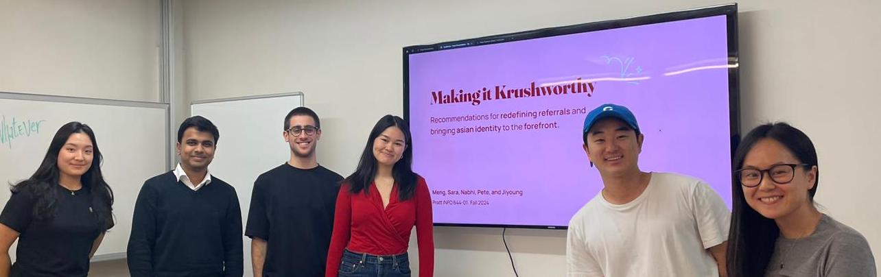
The Team
A group of usability experts exploring dating behaviors.
Jiyoung Lee
Jiyoung Lee
Nabhi Shah
Nabhi Shah
Pete Wise
Pete Wise
Sara Ma
Sara Ma
Meng Shi
Meng Shi
UX Consultants @Pratt DX center
UX Consultants @Pratt DX center
Stephen Moon
Stephen Moon
CEO & Founder @Krush(Curelation, Co.)
CEO & Founder
@Krush(Curelation, Co.)
Alex
Alex
CTO @Krush(Curelation, Co.)
CTO
@Krush(Curelation, Co.)
Initial Hypothesis & The Problem Statement
Goals that changed
I believed that usability could address any business challenge until we encountered the app’s referral problem. It quickly became clear that focusing solely on usability wouldn’t necessarily increase referral numbers, though, at that point, it was merely a hypothesis. This led to the basis of our initial hypothesis and the problem statement.
Hypothesis
"If dating app referrals feel too formal and detached from natural social interactions, then users are unlikely to engage with in-app referral flows, even if usability issues are resolved, resulting in stagnant referral numbers."
Problem Statement
"Referrals on dating apps are currently ineffective, as they do not align with natural user behaviour and social interaction patterns. There is a need to explore solutions, based on user needs, that make referrals more engaging and test their effectiveness in driving user participation."
Initial Plan
Methodology 1
We initially structured the process for solving the problem statement into three stages, each involving five moderated user interviews. I conducted one interview per phase, and then we collaboratively analyzed the insights for each objective, as shown in the figure below. However, after phase 2, an unexpected development in the project prompted us to adjust the process slightly (more details on that later in the case study).
The insights gathered from interviews were quantified as percentages to represent user sentiment on key recurring themes. Additionally, a qualitative analysis was conducted to gain a deeper understanding of user needs and behaviors related to dating apps.

Made the right assumptions
Validity of the hypothesis
100%
Users reported never referring anyone to a dating app and expressed no interest in doing so.
The Phase I and Phase II interviews confirmed the hypothesis and led to two great ideas, which were further validated through user feedback. From the initial round of interviews, we discovered that users view referrals as a social activity (which aligned with my hypothesis). As a result, we designed two features aimed at making referrals more engaging by incorporating a social element.
Inviting A Friend to be Your Matchmaker
Feature #1

Invite your friends to assist in finding your perfect matches. This approach has been proven effective by platforms like Tinder and Bumble, making it a reliable and essential strategy, supported by the following data.
87%
Users would love to use this feature.
50%
Prefer our design over competitor’s offerings.
Tell Your Krush
Feature #2
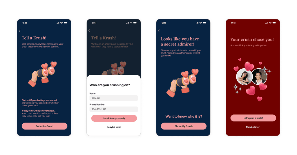
87%
Find this idea to be bold & fun
Find out if your real-life crush feels the same way through an anonymous message on Krush. This feature adds a fun and exciting twist to referrals, as users won’t immediately recognize they’re referring someone. The crush needs to download the app to see if the feeling is mutual. While this may not significantly boost referral rates due to the low percentage of users involved, its engaging nature could spark conversations about the app, leading to organic growth.
There is a Catch
There is a bigger problem to solve
100%
Users were confused about the value proposition the app.

While validating and testing referral ideas, we found that the app, in its current state, fails to offer a compelling value proposition, especially for its target users, particularly Asians. Most users we introduced to the app were unsure why they should choose it over other popular alternatives, as they couldn’t see a clear reason to use it.
This led us to ask the question: What if the referral works, and users download the app but don’t find enough value to stick around and fully experience it? This insight prompted us to revise our methodology and accommodate this user need in the features we recommend,
Final Process
Methodology 2
We adjusted our process after phase two to better highlight the app’s value proposition of being centred around Asians. This led us to design features that prominently showcase the app’s unique Asianness.

Designing Dating for Asians
Recommendation to embrace the ASIAN identity.
The outcome was two recommendations that set the app apart from competitors while staying true to its advertised value proposition as an Asian-centric dating platform.
Asian community that help find the best matches
Feature #3

In this feature, Krush’s community will function as a social feed celebrating Asian culture, showcasing memes, events, and opinions. On the dating side, it will include a compatibility score derived from user activity within the community, making it easier to connect with people who share your vibe.
75%
would love to have this feature.
Daily Snap & Connect
Feature #4

KRUSH’s current community feed is filled with singles eager to connect with nearby "ACTIVE" users. They are seeking more interactive ways to engage with others on the app. Introducing a daily photo challenge centered around Asian-inspired themes like dating, food, and culture can encourage users to connect with active locals in a fun and creative way.
62%
Users want to use this feature.
Results
The judgement
As a usability expert, the goal was to validate the ideated features and do the filtration process through user needs and preferences. From over ten features initially developed, we refined the selection to 4 key features addressing a critical issue faced by the client: narrowing the focus amidst the endless possibilities of a dating app. All of this was backed by user insights, giving further confidence over the recommendations we make.
As a consultant, the aim was to persuade the client to adopt the features we recommended. The result was that the client decided to implement two (The matchmaker & The community vibe) of our suggested features, and the insights we provided helped them realize the next steps to focus on, the value proposition. This successful communication of our message was a significant win as a consultant.
Innovating Experience
Innovating Experience
Creating empathetic designs, swiftly enhancing business solutions, and transforming lives for diverse individuals, in other words, innovating experiences.
Creating empathetic designs, swiftly enhancing business solutions, and transforming lives for diverse individuals, in other words, innovating experiences.
Innovating Experience
Creating empathetic designs, swiftly enhancing business solutions, and transforming lives for diverse individuals, in other words, innovating experiences.